


Understanding and Leveraging Open to Buy to Master Your Retail Inventory
Occasionally when consulting with a client I’ll ask if they have a dashboard for their business and they’ll say something like “yeah, I think I’ve got something like that somewhere.”
In other words, we had a dashboard, but it sucked so I stopped using it and can’t even remember how to get to it.
If a dashboard doesn’t help you seamlessly visualize your data in a user-friendly way that’s simple and easy to understand at a glance, or if it takes hours every week to keep it updated, you probably won’t use it long.
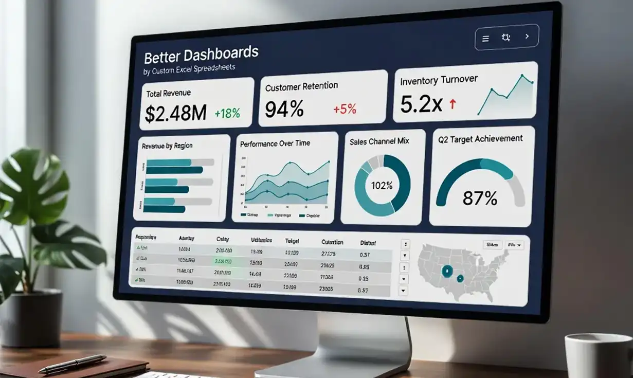
That’s why in this post, I’m going to walk you through 7 principles for better data visualization so you can take your Excel or Google Sheets dashboards to the next level and start seeing clarity instead of clutter.
Why Good Dashboard Design Matters
Whether you’re a small business owner, an analyst, or a manager, dashboards help you see what’s happening in your business at a glance. But too many dashboards become data dumps—overloaded with metrics, charts, and confusing layouts. In my experience, if dashboards aren’t easy to update and highly intuitive, people stop using them and get back to flying blind and shooting from the hip.
At a high level, a well-designed dashboard:
-
Makes data-refreshing simple and easy, if not fully automated
-
Highlights what matters most
-
Gives the user the ability to “drill down” using slicers and filters
-
Speaks clearly to its intended audience
-
ONLY includes the most important data visuals
-
Is so aesthetically pleasing you look forward to opening it
Let’s look at the 7 key principles that make that possible.
Clarity Over Complexity
Why it matters: Your dashboard may be in a spreadsheet like Excel or Google Sheets, but that doesn’t mean it should look like one! It should summarize, not overwhelm.
-
Stick to essential metrics—less is more.
-
Use simple charts that are easy to interpret (e.g., bar, line, gauge).
-
Avoid overloading the page with too many visuals.
-
Implement a BAN. Use a Big Aggregate Number to visualize your most important metric(s).
-
Use size, color, and placement to emphasize key metrics.
-
Place high-priority KPIs in the top-left (where most people start reading).
-
Group related metrics together.
Pro tip: Ask, “What decisions should this dashboard help someone make?” Then remove anything that doesn’t serve that purpose.
Design for Your Audience
Why it matters: A dashboard for your accounting team should look different than one for your CEO. Be sure to keep your target audience in mind and don’t hesitate to build out a couple different dashboards for different audiences when needed. Here are some tips:
-
Tailor content to user roles and decision needs.
-
Use familiar terminology, not technical jargon.
-
Make sure your data answers the questions your audience is asking.
Example: A marketing dashboard may highlight conversion rates and campaign ROI, while an operations dashboard focuses on lead times and resource utilization.
Building an audience-oriented or audience-focused dashboard will ensure your hard work doesn’t go to waste.
Choose the Right Chart Types
Why it matters: The wrong chart can mislead or confuse your viewers.
-
Use bar charts for comparisons, line charts for trends, pie charts only for simple part-to-whole relationships.
-
Use horizontal bar charts for data where the data labels are longer text strings and column charts for shorter text labels.
-
Avoid 3D charts unless they serve a very specific purpose.
-
Use tables only when precision matters or detail is essential.
-
Don’t be afraid to experiment! Use 2 or 3 different chart types to visualize your data and keep only the one that looks the best.
Automate Data Refresh (as much as possible)
Why it matters: If you have to spend hours getting the data into your spreadsheet before it can be visualized, you’ll get behind and the friction of updating the data will eventually bring the whole dashboard enterprise to a screeching halt. Here are some ways you may be able to automate your data import and data refresh.
-
Use Excel’s PowerQuery to automatically pull in data from a variety of data sources
-
Use VBA scripts (macros) to import datasets with the click of a button
-
Use APIs within VBA scripts to automatically pull in data from online sources
-
Use 3rd party automation platforms like Zapier, PipeDream and n8n to pull data into Excel or Google Sheets.
Keep It Consistent
Why it matters: Inconsistent styles, colors, and formats make your dashboard feel messy and hard to read.
-
Use a uniform color scheme (e.g., green for good, red for bad).
-
Align text, charts, and data elements cleanly.
-
Stick to standard date formats and naming conventions.
Pro tip: Create a dashboard style guide if you build them often.
Make it Interactive
Why it matters: Giving users control can make dashboards much more powerful—but remember, only when it helps answers real questions. Don’t add complexity unnecessarily. That said, I’ve written a whole blog post on why interactive dashboards are the way to go and how to use them. Here are some quick tips to get you started:
-
In Excel, use slicers, drop-downs, and PivotTables for interaction.
-
In Google Sheets, use filters, data validation, or App Scripts for automation.
Bonus: Don’t Forget Mobile Usability
If your dashboard will be accessed on phones or tablets, test it on smaller screens.
-
Keep visuals large and legible.
-
Limit scrolling where possible.
-
Use single-column layouts for mobile-friendly designs.
Final Thoughts: Great Dashboards Drive Better Business
Good dashboard design isn’t about flashy charts or cramming in more data.
It’s about clarity, usability, and decision support.
By applying these 7 principles, you can build dashboards that your team actually uses—and that lead to smarter, faster business decisions.
